Not because the work is bad. Because everyone in the category is following the same visual rules.
One image, mapped the way the studio maps every brand on this site. Free. Usually back within a few days.
For fashion and luxury brands.
Start your reading →The same lens, applied to one image, returned within a few days as a custom page. Yours will look like one of these.
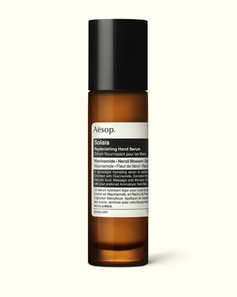
Amber glass, pharmaceutical typography, perfect centre isolation. The conventions hiding in plain sight.
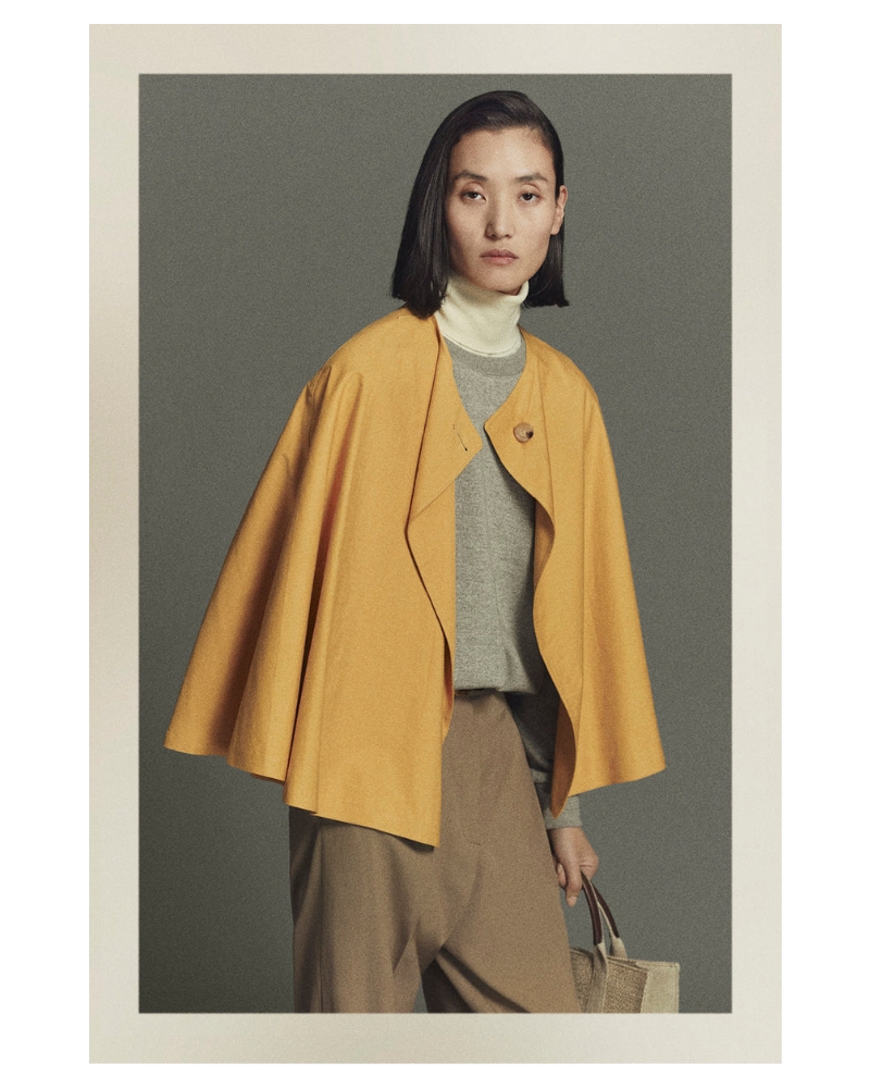
Quietness as authority. The image system that removes everything except the garment.
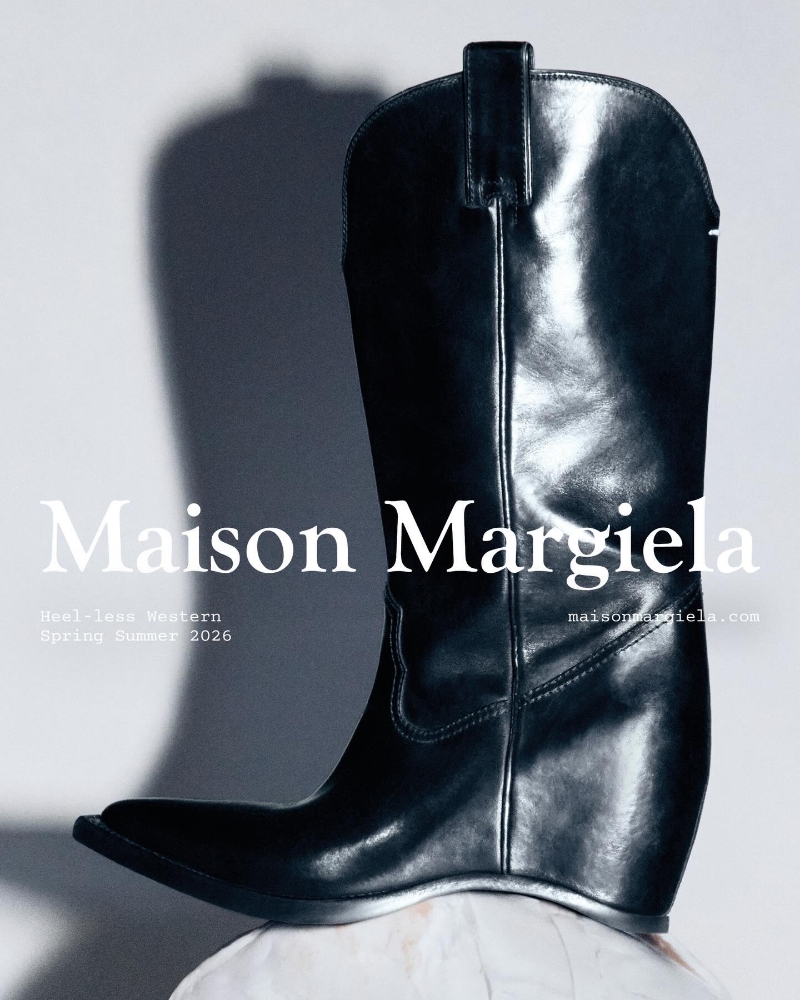
What conceptual fashion looks like when it has to operate as a brand.
The whole point of a Reading is to map what your audience experiences, not what your brand intends. So I don't need decks, strategies, briefs, or background. I just need the surface, and the image to read.
The Reading shows the studio's thinking applied to your brand, in one image. After that, you'll know whether the lens is useful before you commit to anything paid.
If it lands, the next step is a thirty-minute call to talk through what comes next. If it doesn't, you've still got an honest read of one of your images.
A one-page diagnostic, scoped to one image. Free, returned within a few days.
Start your reading → Opens your email client with the brief pre-filled. I read every email myself.